Redesigning a LOW-CODE platform to improve activation & efficiency

As Director of Design at Appsmith, I led a comprehensive redesign of this low-code platform that enables backend developers to build internal applications without requiring frontend expertise.

This project addressed critical usability issues by rethinking the platform's information architecture to improve navigation, reduction in cognitive effort, and significantly improving user activation.

Duration

Jul, '23 - Dec, '24

Responsibilities

Design Leadership

Impact

58% improvement in activation time; 3x improvement in navigation efficiency

Background context

Appsmith is a low-code platform that enables developers to build internal apps, without having to write a lot of code. Users can drag & drop UI widgets on to a canvas and they can configure them in terms of look & functionality. They can connect to their datasources through built-in integrations, write javascript code to express business logic and easily deploy an app.

All of the functionality of connecting to databases, writing queries, dragging widgets on to a Canvas and writing code are housed in the Appsmith IDE.

Appsmith IDE, prior to May 2023

Problems with the Platform

When I joined Appsmith, the platform was facing several critical issues:

  • Poor Activation Rate: Only 6% of new users connected their own data sources

  • High Learning Curve: Users struggled to understand how to connect query outputs to UI widgets

  • Excessive Context Switching: Completing core tasks required constantly moving between different parts of the interface

  • Long Time-to-Value: It took an average of 52 minutes for users to realize the platform's value

These problems were being addressed by two separate teams working in silos, with multiple iterations over 10 months yielding little progress. The teams were experiencing burnout and declining morale from the lack of clear direction.

My Role

I drove the complete vision & execution strategy for this project with a team of 2 Designers, 1 PM, 2 Engineers, 1 QA and an Engineering Manager to completely revamp the information architecture of the platform.

Leadership: I set clear direction and goals for each of the functions (including PM and Engg.) and how we should approach in implementing this EPIC project. I aligned stakeholders (the founders of the company) by establishing measurable UX metrics for success.

Simultaneously, I consulted with other teams in the company to socialise how they should adopt this new IA to run experiments and design features.

I guided two cross-functional teams in solving for learnability & activation

Recognizing that two teams were addressing symptoms rather than the root cause, I intervened and advocated to solve the problem at the root level: a fundamental redesign of the information architecture of the platform.

This decision was informed by the work of our team of designers:

  • Conducting a comprehensive audit of usability issues and papercuts.

  • Analyzing user recordings to understand navigation patterns

  • Facilitating workshops with stakeholders and subject matter experts

  • Creating core flow diagrams to map user tasks and cognitive load

Creating alignment through Vision

To gain organizational buy-in for the platform's revamp, I:

  • Developed a clear vision for how a strong information architecture would solve multiple problems

  • Created and presented high-level prototypes to demonstrate the potential impact.

  • Established measurable UX metrics tied to business outcomes.

  • Proposed a 7-phase execution plan with clear milestones.

  • Proposed how an Information Architecture revamp will correlate with activation metrics, to secure executive support.

Loom presentation to the company explaining the vision.

Team charter document

Team leadership & restructure

To revitalize the team and establish clear direction:

  • I proposed to rebrand the "New Developers Pod" as the "IDE Pod" with a focused charter.

  • Created a one-pager to clarify the team's mission and objectives.

  • Conducted a pre-mortem exercise to identify potential failure points

  • Built confidence through a transparent &. methodical process.

Providing a definition of success

I established assessment criteria to guide and evaluate design iterations for each phase of this massive project.


All of these measures helped immensely in establishing trust with the team and made them once again ready to tackle a complex intertwined problem.

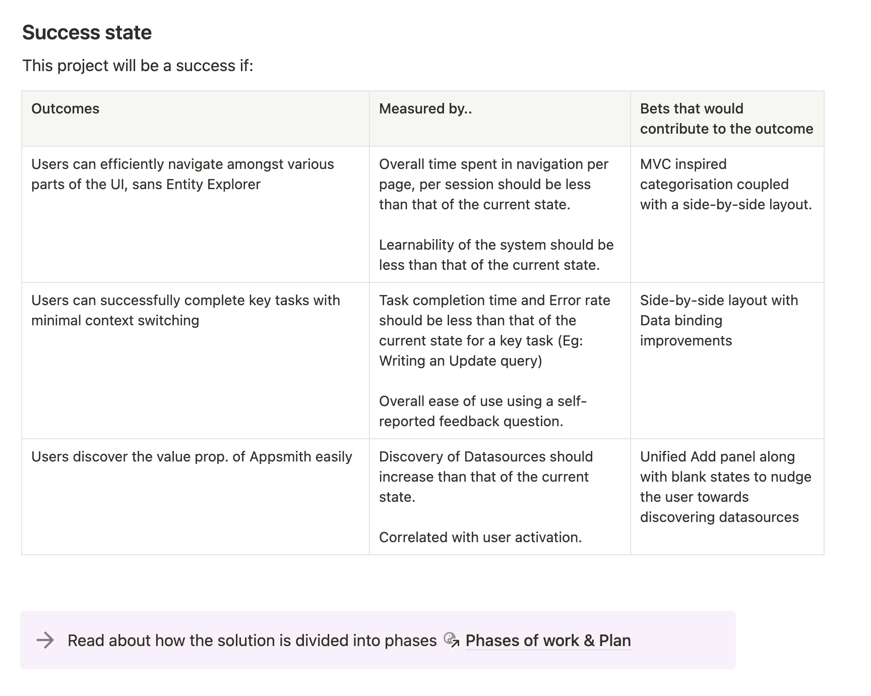
Defined success states through UX metrics

Exploring the problem space

Exploring the problem space

Observing & mapping user behaviour

Our team of designers coupled with a PM and EM wanted to understand where people struggle within the Appsmith IDE.

To test this, I advised that the team conduct several task-based usability tests to identify various friction points. Also, the designer on the team wanted to start afresh and did secondary research with internal users of the platform to understand their friction points.

Further, we looked at user behaviour analytics to understand how new users and advanced users behave within the Appsmith IDE.

The problems that were synthesised could be broadly categorised into two groups: Problems with Navigation and Problems with Learnability.

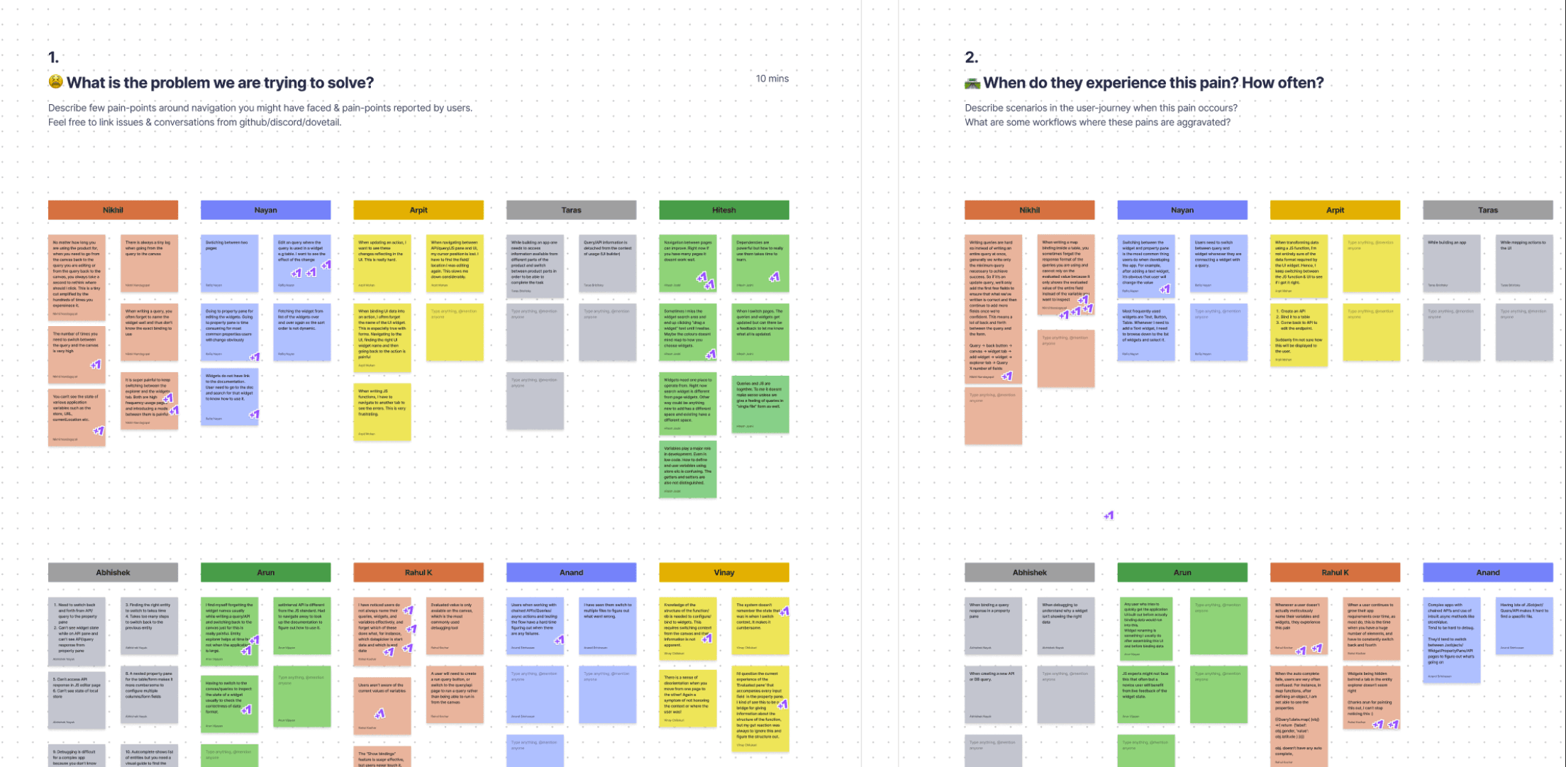
Designer in the team doing a workshop with subject matter experts to unearth various problems

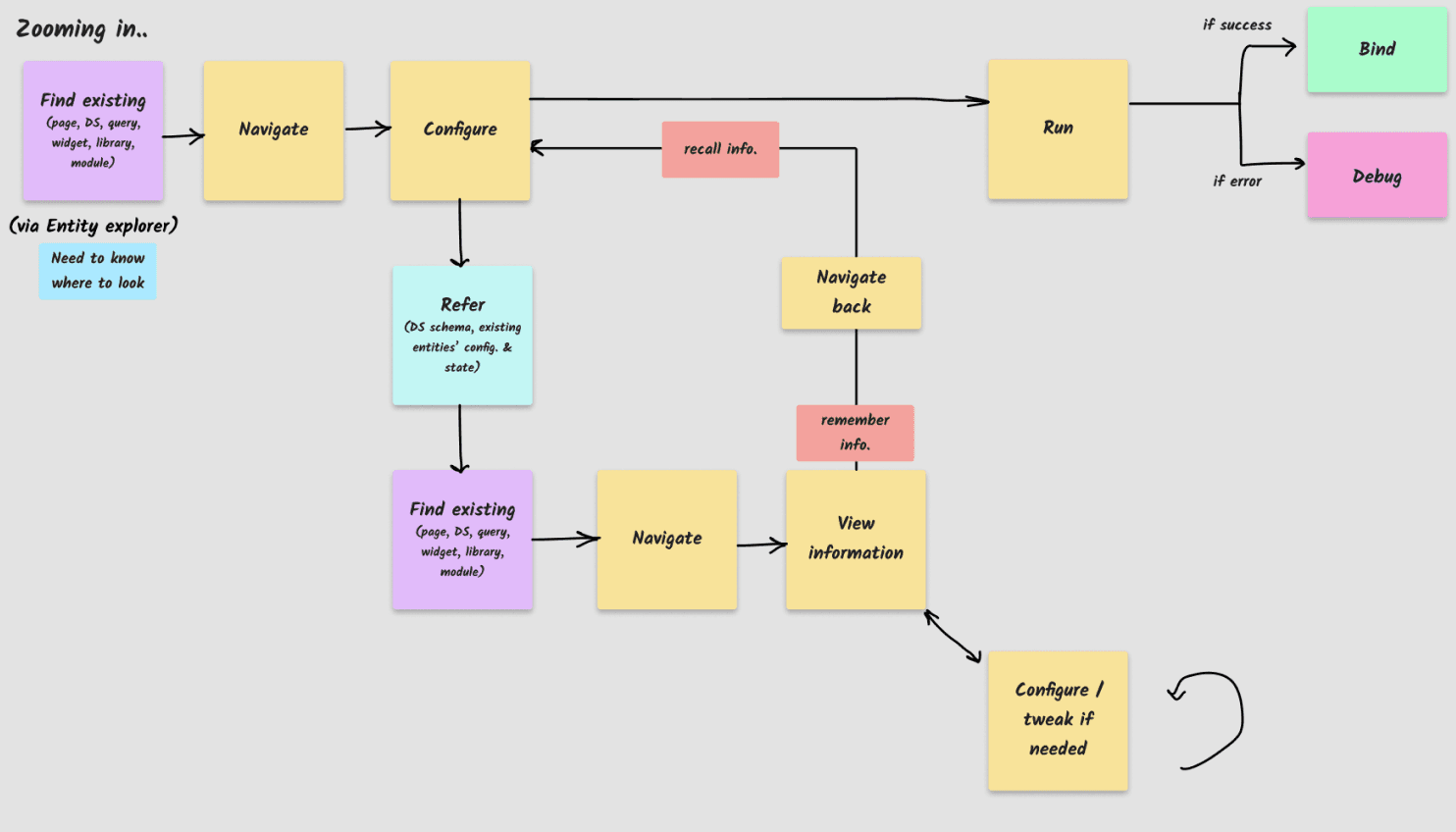
Given that the team previously had spent 10 months in trying to solve the problem, I created an abstract flow diagram to illustrate cognitive friction and how this creates problems when a user has to switch context.

I wanted to provide a reference map for the team to rely on so that they do not get tangled up in the problem complexity.

All these exercises to understand the problem in various viewpoints proved invaluable for the team to confidently take product decisions.

Iterating through the solution space

Iterating through the solution space

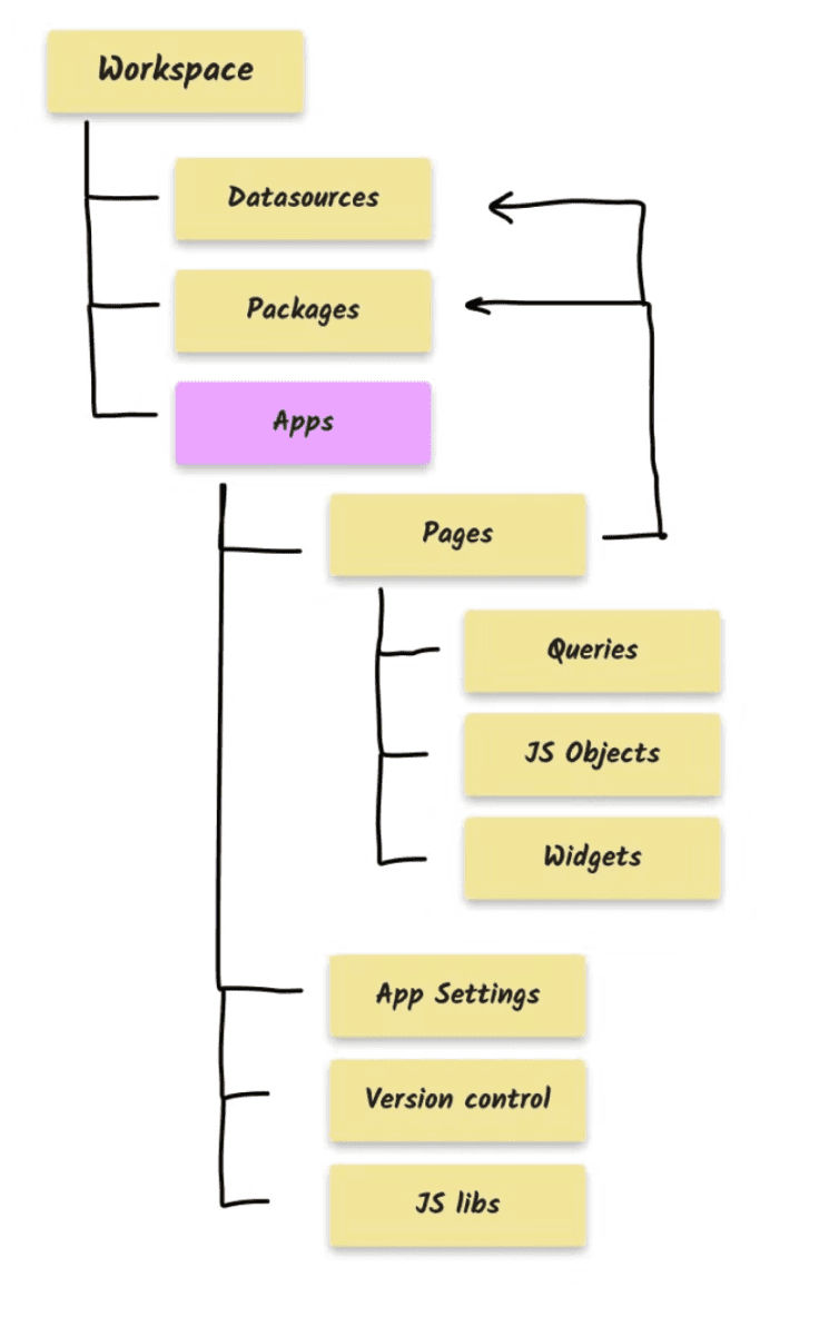
Content hierarchy within the Appsmith IDE

Translating the underlying IA to the UI

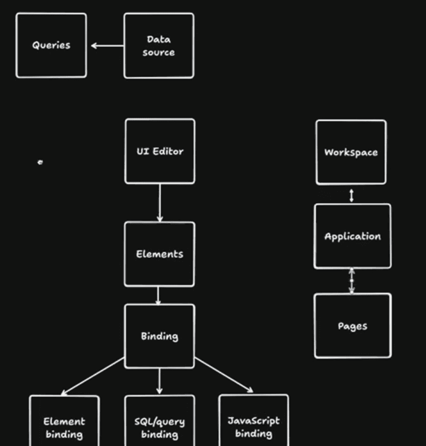
We looked at the content hierarchy of various entities within the IDE and wanted to translate that structure as-is.

The idea was to not introduce any further grouping and let the underlying structure transparently reflect on to the UI.

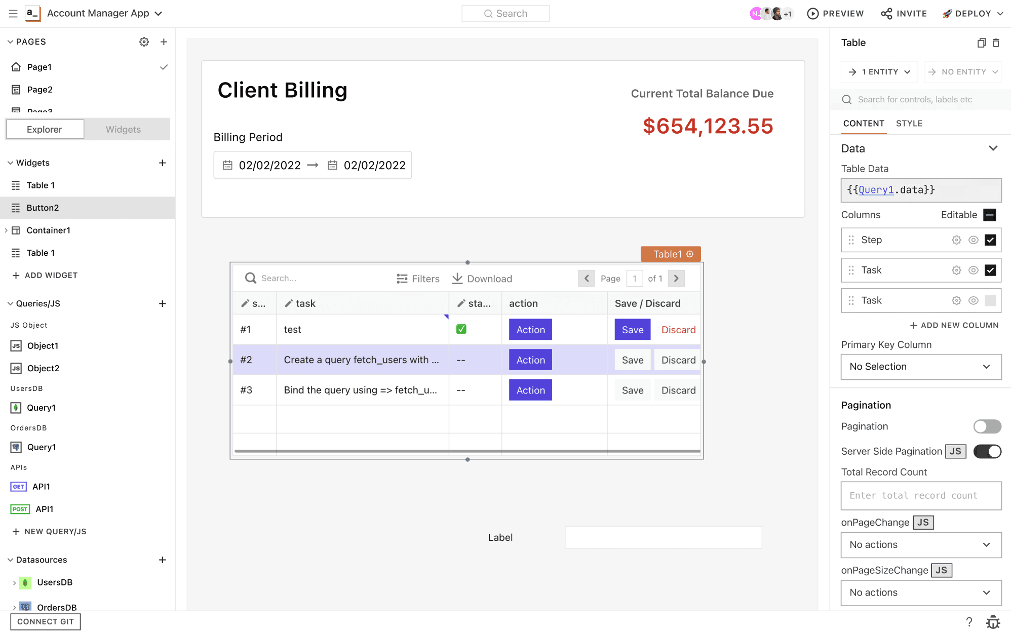
Introducing a Sidebar for easy navigation

Once we were clear about how the IA is going to translate to the UI, we looked at various patterns of how we could bring this IA to the UI.

A ubiquitous pattern in developer tools is the Sidebar. We wanted to adopt this so that it enables users to quickly navigate amongst various entities but also provide a familiar mental model to our developer audience.

Sidebar that represents the higher-level constructs of the IDE.

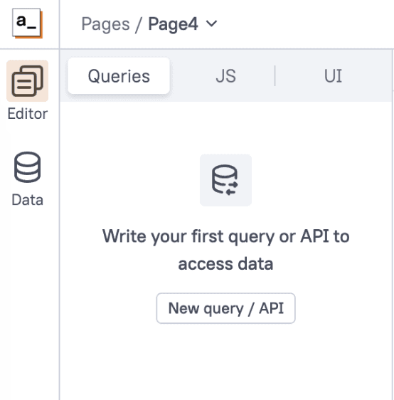
"Page segments" that not only provide easy context switching, but also remember the last accessed entity by the user.

Context switching made simpler with Page-level segments

In the previous IDE, users had to remember what they were doing previously whenever they had to switch context. This was a massive pain.

It is the system's job to remember what the user was previously doing and aid them in their work.

The beauty of representing the key elements of the IDE: Queries, JS Objects and UI elements in the form of a segmented control afforded us in aiding navigation further.

The system remembers the last accessed entity by the user, within each of Queries, JS and UI, significantly lessening the cognitive load inherent in context switching.

Sketch research to figure out user's mental model of the platform

Validating designs with continuous user testing

We've iterated continuously on our designs based on regular user testing. The team had implemented a proof-of-concept and we used this to do several user tests with internal and external audience.

To test the IA, we asked the users towards the end of the session, to draw a diagram representing various entities within Appsmith. I was overjoyed to see how a clean IA can help in forming a solid conceptual model of the product.

Minimising context switching further with a Side-by-side layout

From our user observations, we know that people constantly switch between Queries and UI, JS Objects and UI. It is important for us to reduce the need for this context switch so that users are able to write code and take advantage of the UI on the side.

Initially, we wanted the side-by-side mode to be the only way for users to access the IDE in. However, we heard from our internal users that they missed the flexibility of writing code in a full-fledged code-editor.

Hence, we decided to retain the best of both worlds by introducing the side-by-side layout as a mode.

A novel navigation system:
The goodness of a code-editor fused with the convenience of a Canvas tool

A novel navigation system:
The goodness of a code-editor fused with the convenience of a Canvas tool

A novel navigation system:
The goodness of a code-editor fused with the convenience of a Canvas tool

Helping the team to traverse various iterations, zero-ing on this side-by-side layout, enabling the team to see why this solution works, and validating it with a lot of user-testing, is something I consider to be a big win for me as a design leader. Through this process, the team significantly gained clarity and thereby confidence in terms of moving forward with a solid solution. 💪🏽

Mitigating RISK with a phase-wise rollout

As a team, we were intentional about not disrupting existing users' workflow.

The plan was to release specific aspects of the redesign in phases so that users progressively experience the changes and are able to get value.

The team monitored user behaviour closely after the release of every phase to check for any friction points and tackle them, immediately. Kudos to the PM for not only tracking this actively but also making the team to be a part of this process.

A visual overhaul

A visual overhaul

With the advent of a new design system which was in the works for an year and was finally live, it was easier for us to realise the vision of making the platform have a consistent personality with a modernised look & feel.

New icon-set that perfectly aligns to the pixel grid

New icon-set that perfectly aligns to the pixel grid

I proposed and encouraged the Engineering team that we try and incorporate visual changes to the platform as the team would be working on the entirety of the codebase and this is a great time to get the changes in.

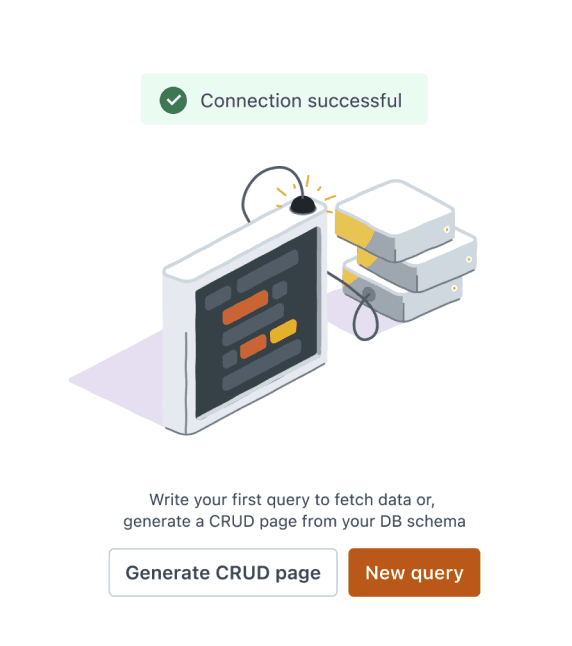
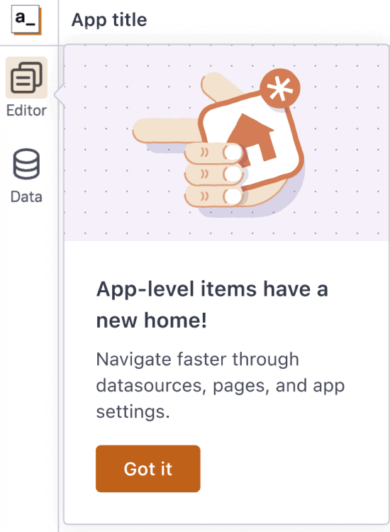
Revamped illustration set

Purposeful Illustrations

With the help of a UI consultant, we redid our Illustration set for the IDE. The intent was to have illustrations that aptly communicate the system's state along with clear call to actions so that the user always knows what to do.

PT Root UI. A legible and a beautiful typeface for Appsmith IDE.

Legible Typography

Information density is an important aspect to look at in an IDE. So, we were intentional about typography and chose to introduce a new typeface which has ligatures and is Uni-width!

PT Root UI. A legible and a beautiful typeface for Appsmith IDE.

Legible Typography

Information density is an important aspect to look at in an IDE. So, we were intentional about typography and chose to introduce a new typeface which has ligatures and is Uni-width!

PT Root UI. A legible and a beautiful typeface for Appsmith IDE.

Legible Typography

Information density is an important aspect to look at in an IDE. So, we were intentional about typography and chose to introduce a new typeface which has ligatures and is Uni-width!

Brand new IDE 2.0

All of these changes culminate in a brand new IDE for the Appsmith platform

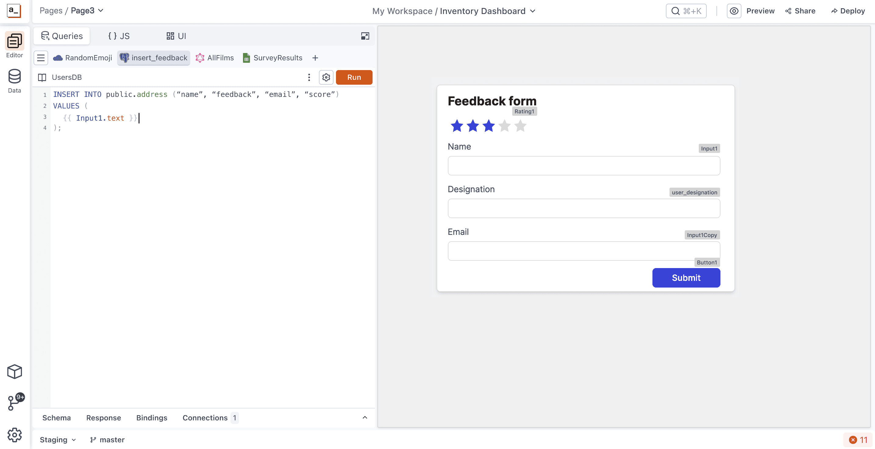
The new IDE with a side-by-side mode which minimises context switching, significantly.

Impact

The redesign delivered substantial, measurable improvements:

  • 58% reduction in Time-to-Activation with just the IA changes, without additional onboarding

  • 2.8x reduction in navigation time for core tasks

  • Positive community feedback from users appreciating the improved experience

  • Enhanced team morale and renewed confidence in the product direction

Learnings

  • Process prevents burnout: Structured approaches are essential, especially for complex projects and mid-level designers.

  • Skill-Task alignment: Matching designer experience level with task complexity is crucial for success.

  • Consistent communication: Repeating key messages until they become part of the team's vocabulary drives alignment.

  • Clear assessment criteria: Giving the team criteria to evaluate decisions (efficiency and learnability) empowered everyone to maintain focus on objectives.

  • Measurable UX metrics: Establishing clear metrics not only validated our approach but provided a framework that benefited other teams across the organization.

This project demonstrated how strategic information architecture can transform product experience, team dynamics, and business outcomes. By addressing fundamental structural issues rather than symptoms, we created a solid foundation that dramatically improved user activation while enabling future innovations to be built on a coherent, intuitive platform.

There is so much more to this story..

It's reserved for in-person conversations.

© VINAY CHILUKURI,

2025

Illustrations from Lukaszadam, Undraw.co

© VINAY CHILUKURI,

2025

Illustrations from Lukaszadam, Undraw.co

© VINAY CHILUKURI,

2025

Illustrations from Lukaszadam, Undraw.co

Create a free website with Framer, the website builder loved by startups, designers and agencies.