Helping spiritual seekers with Yoga, everyday
Isha Foundation, founded by Sadhguru, is a non-profit that concerns human wellbeing and spiritual development through Yoga. It’s offerings were scattered across 42 websites! As a result, the experience was totally fragmented with a fundamental problem – the key information was not at all discoverable.
There were several yoga related practices that people needed to access on the go. As a result, the foundation wanted to provide a mobile app to help spiritual seekers to access yoga offerings, everyday.
Duration
2016 - 2017
Responsibilities
Information architecture, Interaction Design
Impact
37% increase in yoga program registrations; Donations through the app averaging 200K / month.
My Role
Touched by the insight of Sadhguru and deep experience that I had felt through ISHA foundation’s yoga programs, I signed up as a volunteer.
My role was to conceptualise a mobile app given the various offerings of Isha, design the flows and provide direction how it could help the org. in terms of their goals. I was contributing as a UX Lead by working nights, for about 8 hours per week.
Who are our Users?
Our users were anybody who was a follower of Sadhguru on Twitter / Facebook. These could range from people who haven’t done any program with Isha to people who are meditators. The important aspect is they want to know more about the wisdom from Sadhguru and get updates on yoga programs and volunteering opportunities.
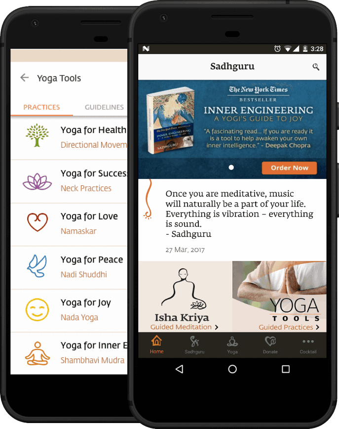
Making sense of the Information

Old navigation on isha.sadhguru.org. — “How do I accommodate all this in the app?” 🤔
Seeing from the lens of Information Architecture (IA)
When we look at the content from the user’s needs, business needs and the frequency of content updates – we arrive at a point-of-view for the information architecture.
User Information Needs
Analytics data revealed that people primarily look for:
Content from Sadhguru – videos, articles and quotes.
Where Sadhguru would be speaking next and if they could attend that event.
Upcoming Isha yoga programs.
Business Needs
Isha wants to increase yoga program registrations. The intention was to achieve this by giving timely updates of programs happening in the participant’s city.
Donations are important to the org. and there needs to be a way for people to discover various initiatives by Isha and donate for the cause.
Seeing from the lens of IA
When we look at the content from the user’s needs, business needs and the frequency of content updates – we arrive at a point-of-view for the information architecture.
User Information Needs
Analytics data revealed that people primarily look for:
Content from Sadhguru – videos, articles and quotes.
Where Sadhguru would be speaking next and if they could attend that event.
Upcoming Isha yoga programs.
Business Needs
Isha wants to increase yoga program registrations. The intention was to achieve this by giving timely updates of programs happening in the participant’s city.
Donations are important to the org. and there needs to be a way for people to discover various initiatives by Isha and donate for the cause.
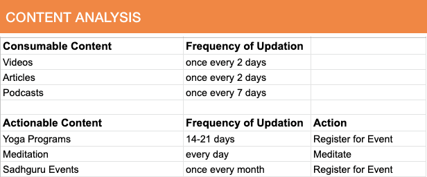
Content analysis
I did a content audit of the site and looked at content that is actionable and consumable. I also sought how frequently certain content was updated from the team.
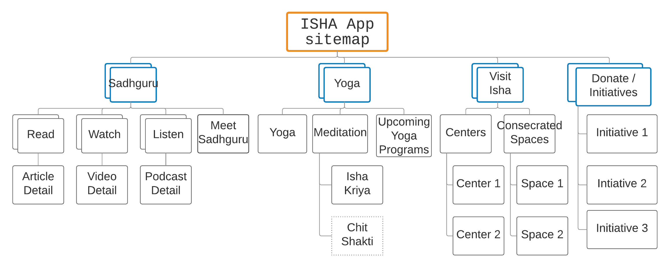
Triangulating User’s information needs, Business Needs and Content gives rise to an Information Architecture.
..
Design
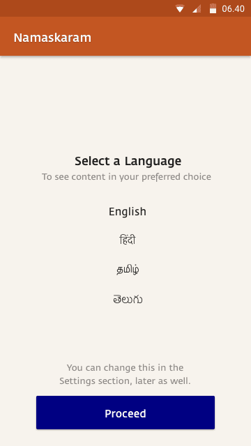
Navigational choices
The stakeholders had proposed to have all the navigation items on the web as part of a hamburger menu on the mobile. However, the bottom-bar navigation was a better bet for the information architecture we had.
In order to resolve this, I have not only pointed out Google’s then recently updated material design guidelines, but also educated them why the bottom-bar was efficient and how it increases content engagement.
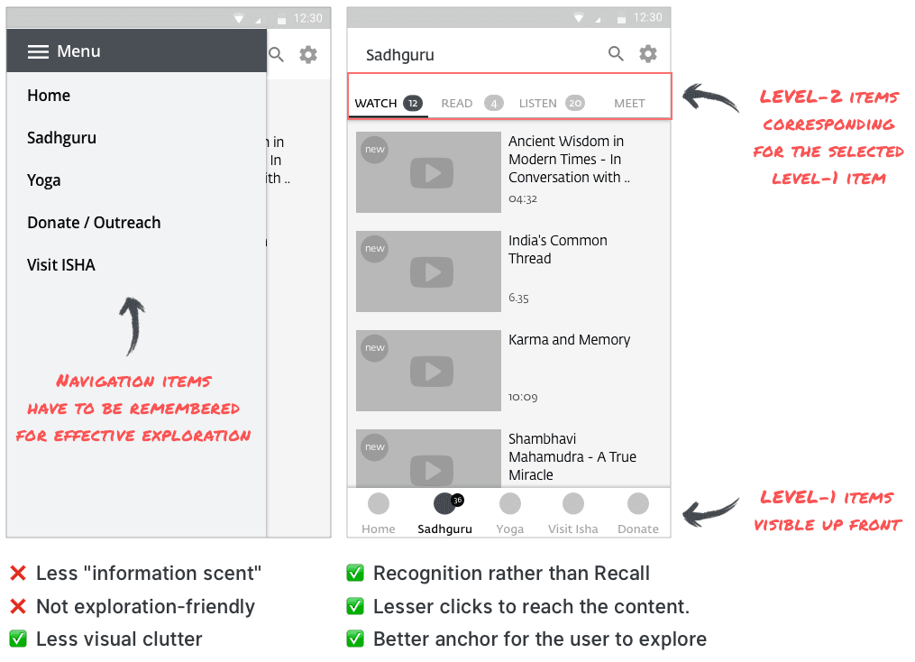
By 2017, the hamburger menu had become so pervasive that it was treated as a standard design pattern.
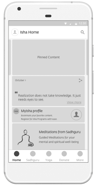
I’ve created designs for all the screens as medium fidelity wireframes.
I used these as reference for my discussions with stakeholders. I have also done Usability testing for the key flows with some Isha foundation volunteers at an event in Bangalore.
Visual Design
I created a style guide for the visual design of the app. However, I could not execute all the screens due to my professional work commitments.
The team decided to go with the in-house visual designers due to development timelines. They felt that visual design for the app needs art direction incorporating various motifs used in Isha’s properties, over the years.
As a result, the visual style proposed by me has been modified.
..
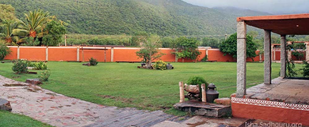
Inspiration for the color scheme: Isha Yoga center, Coimbatore
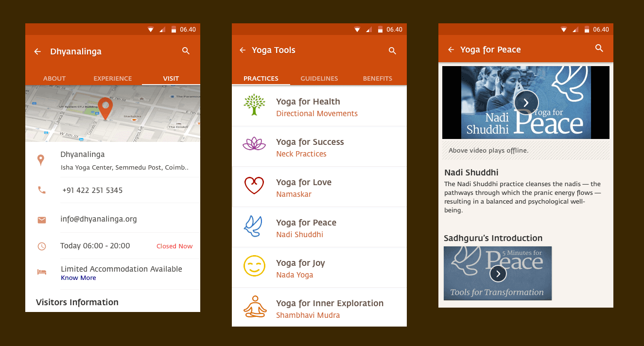
Screens with the color scheme
Impact
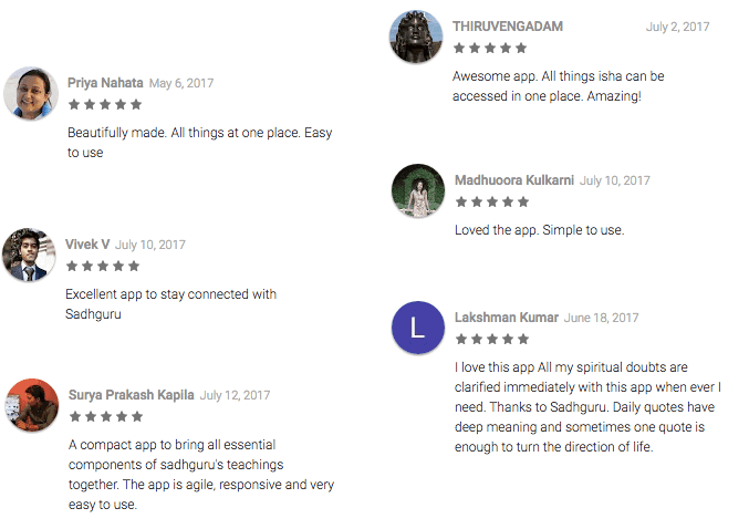
The app received unanimously positive reviews touting that it is extremely simple to use. Isha yoga program registrations have increased by 37%, thanks to the mobile app. Donations through the app were averaging at INR. 200k per month, without any marketing whatsoever. Further improvements to the donation forms were planned in order to make the donation experience even better.
This has been one of the most enriching projects that I had worked on, in terms of impact and contributing my bit to the spiritual community.
Other case studies

Building a high-performing Design team at Appsmith
Redesigning a low-code platform to improve user activation & developer efficiency

Reimagining ecommerce for the next 100mn users in India


© VINAY CHILUKURI,
2025
Illustrations from Lukaszadam, Undraw.co
© VINAY CHILUKURI,
2025
Illustrations from Lukaszadam, Undraw.co
© VINAY CHILUKURI,
2025
This case study is not optimised for viewing on a smaller viewport!
Please visit from a desktop browser.
This case study is not optimised for viewing on a smaller viewport!
Please visit from a desktop browser.